
What lies ahead?
That’s a dangerous game, in this era, as I suggested in 2020 (The Changes A-coming). But with an eye on the tech future, I thought I’d rummage around in the basement of gadgets, and content, and the mechanisms to both deliver content to gadgets and for the gadgets themselves to be something more, to see what might be around the corner. This is a longish one, for which I apologise.
On the one hand, devices during COVID have been a miserable failure. The Apple Watch was supposed to be our path to a self-measuring future but that has been something of a failure (Doctors say it’s time Apple Watch ticked all the health boxes. A lot of the blame seems to be placed at the feet of doctors, which strikes me as a cop out. If the devices’ success required changing the procedures, and expecting increase in the cognitive workload, of the most time-poor and under-resourced professions on the planet, then I think our breathless excitement at this new era of wellness and health might have been a bit more, well, breathy.
And don’t get me started on how we have failed to use our ubiquitous mobile devices to better manage COVID movements, contact tracing, travel and entry documentation etc. Well, actually, do, as I have already written about it (The Future of Pandemic Preparedness: Digital Health Passports for example). My general feeling is that the people who could have made a difference tended to focus on the wrong things (well the right things, but at the wrong time: decentralised identity, experimental technology etc) where the situation was desperately crying out for something practical that could be realistically deployed within a useful timeframe. I compared the challenge a year ago with that of attempts to deploy an e-passport here. Both pieces were commissioned by Roche Diagnostics but content was not edited or directed in a way I felt changed their intent, so I’m happy to keep my name atop them.
So yes, I don’t think the COVID era will be one to closely associate with leveraging personal technology for the benefit of the greater good. After all, these devices have been entirely designed to deliver a version of privacy that is at odds with one that governing institutions might get away with. Our devices are privacy conscious only insofar as they protect commercial and financial interactions. Apart from that they are specifically designed to ooze other forms of data, from location to apps used, search terms, etc. In fact, for Alphabet, Amazon and Meta, the devices in effect operate on a subsidy model, where the operating system, the device itself (think Kindle, Android devices) and the apps themselves are given away at or below cost because of the high value extracted from the user’s data being sucked out of the device.
For governments this would be a boon, if the user was as disinterested in the implications of this when it comes to government surveillance as she is for commercial surveillance. But COVID has shown us there is no social contract between government and citizen in most democratic states that would allow such information to be (directly) drawn from the device. So there has, so far, been no alignment of interests between companies, individuals and governments to allow our most prized possession to help us get out of this pandemic without lots of gnashing of teeth and wailing.
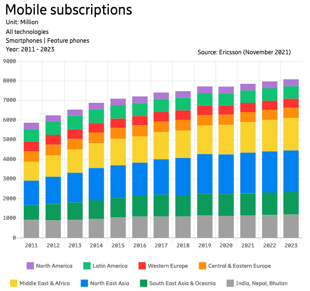
COVID though, has had an impact on our relationship with these devices. Mobile subscriptions – smartphone and feature phone – grew very little year-on-year in 2020, and in many regions of the world actually shrunk, according to Ericsson data (see above). It’s not surprising, I guess: for many of us, the relationship with our phone has loosened a little under lockdown. Or has it? On one hand, we’ve binge-watched ourselves to numbness, with Netflix, Apple, Amazon and others desperately trying to create enough content to keep us hooked. But on the other hand, a lot of the things that make a mobile device so compelling usually have lost their lustre, now that most of the time we’re stuck at home.
And so has evolution of the mobile device remained static? Well, yes, in a way. Accelerometers, biosensors, cameras, gimbals — all of the machinery that makes our device so smart, are relatively useless when we’re in one place. This is perhaps what makes Mark Zuckerberg’s dream of a second life in his metaverse resonate more than it would usually: yes, we are beginning to hate our four walls, painful checks for and restrictions on travel. So even a legless torso and cartoon visage interacting with another might seem, well, worth a punt.
But I think that vision is dystopian, cynical and not where the interesting stuff is happening.
COVID has been about content, but post-covid will be about devices. COVID was about maximising the amount of immobile content — games, movies etc — but when we do break these chains, even if it’s pandemic->endemic state change, there is likely to be a relatively fast transformation of what we can expect our device to do.
The Eye of the Apple
Hear me out.
Predicting Apple’s next move is a mug’s game, but I’ll give it a shot. Part of my research work has involved looking at submarine internet cables, and there’s always one dog that doesn’t bark: Apple. Meta (declaration of interest: I’ve done some research work for them, indirectly), Google (commercial relationship in another area), Microsoft (ditto) and Amazon are all very busy in this space, essentially moving into owning as much of the delivery infrastructure as possible, matching the proportion of traffic they’re responsible for. Structure here means cable, data centers, hardware. It’s a remarkable shift in these industries that has gone little-noticed.
But even less noticed has been the missing player: Apple. As far as I can work out, Apple has taken no significant stake in any submarine cable venture or player; neither has it built a vast network of data centers. (It does have them, but not in the same number as, say, Google. Google has 23 publicly acknowledged data center locations; Apple has less than half that, and, indeed, stores increasing amounts of its data on Google’s servers (Apple Reportedly Storing Over 8 Million Terabytes of iCloud Data on Google Servers – MacRumors).
But this is undoubtedly changing as it gets more into the content business. Apple has something called Apple Edge Cache where it offers to supply hardware to internet service provider (ISP) partners “to deliver Apple content directly to customers”. I won’t pretend to understand the exact arrangement here, but I think it’s fair to assume it’s a way for Apple to get their content closer to users, reducing latency, and a way for ISPs to demonstrate the quality of their service while probably reducing some of their international bills. Netflix and others offer something similar. Netflix: Open Connect and Akamai’s Network Partnerships.
But I don’t believe this is where Apple sees a road to the future. Indeed, though I do love some of the content on Apple TV+, it feels like a very traditional, backward-looking concept — all chrome logos and shadow, slick but somehow dated. I think the smart money is on converting the mobile phone, the watch, the iPad, the VR headset, into a (virtually) single device that interacts with its surroundings much more effectively, and in the process not only accesses the network but, in a certain way, becomes the network.
The Network is the Device
There are certain elements to this. We saw that Apple was deeply involved in the development of 5G — the first time, I believe, a device manufacturer had that much of a role, though I could be mistaken — and early last year posted job ads seeking research engineers for current and next generation networks (6G isn’t expected to be deployed for another decade, but these are generations of technologies, and like generations they’re more of a period than a date.) But I think this time it’s not going to be about 6G, more than it is about AppleG. More recently the same Bloomberg reporter, Mark Gurman, spotted another hiring spree, this time for wireless-chips (Apple Builds New Team to Bring Wireless Chips In-House).
I would agree, however, with Jonathan Goldberg at Digits to Dollars, who before Christmas picked up the Bloomberg story and ran further with it (What Are They Building in There? | Digits to Dollars). This is about vertical integration, he wrote, but it’s also about a lot more:
Beyond that, Apple has some very ambitious plans for communications and they are looking to drive the industry in their direction. They have set themselves some very interesting objectives, or at least left us with some big mysteries. What are they building in there?
I was intrigued enough to try to follow up some of those clues, exposing my lack of technical knowledge on the way. But thinking of it not from the point of the stack (the inner workings, the supply chain, the network connectivity) but from the user perspective, I think there are a few clues that give us enough to make some reasonable guesses:
Apple has filed patents that focus on communication between devices, that don’t involve connecting to networks. Most prominent are patents related to Apple’s project to build semi- and fully autonomous vehicles. Vehicle-to-everything (VTX) is a core part of the future of autonomous/semi-autonomous vehicles, because it makes no sense for urgent, data-heavy, ultrafast communication between devices (think car and streetlight, or car and bicycle) to go onto a network and then circle back to the other device. (Apple Reveals their work on Project Titan’s Vehicle-to-Vehicle Communications System for future Autonomous Vehicles – Patently Apple)
This is sometimes called sidelinking, and is already a part of 5G standards. But for Apple it makes a lot of sense, if you move away from the notion of networks as synonymous with beacons, towers, backhaul, data centers and submarine cables. If your devices are everywhere, be they watch, glasses, computer, car, whatever, then doesn’t it make much more sense to think of them as the network? In the same way Apple moves its content as close to the edge of the network, why not think of Beyond The Edge — all those devices, which you control remotely via your increasingly unified operating system — as the network itself?
Smells and Radar
This requires what we think of as the device to take on some new powers and heft. Part of that is the ability to connect to other devices, but another element is to make it smarter. We have been somewhat groomed to get excited about incremental improvements in the iPhone, but in terms of what new things it can actually do, there’s been very little to cheer about for a decade. It’s been five years since I wrote Nose job: smells are smart sensors’ last frontier and there’s been precious little progress yet on adding smell sensors to consumer devices (I see my old friend and source on all things olfactory Redg Snodgrass has been through three job changes since I wrote the piece, which shows how long ago that is). But smell is a complicated thing, and likely the last thing we’ll see enough commercial imperatives to get it into a consumer device any time soon.
Before that a natural function for the device to have is radar. This is a technology that’s already 90 years old, but its use case for mobile devices has, until recently, not been visible enough to merit the miniaturisation process. That changed last year, with chipmakers like Celeno incorporating Doppler Radar with Wi-Fi and Bluetooth into its Denali chip. It’s perhaps not a surprise that Celeno is based in Israel. Apple Israel just happens to be looking for an engineer to focus on this very technology, among other things (Wireless Machine Learning Algorithms Engineer for sensing and localization – Jobs at Apple).
But what would you use radar for? It’s Apple, so I’m guessing it’s all about the user. The job ad mentions the successful applicant “will be part of an extraordinary group that pioneers various wireless technologies for localization purposes and for wireless sensing applications. You will work with different RF solutions, such as WiFi / Bluetooth / RADAR systems, to provide outstanding user experience for Apple users.” This is about sensing. The radar would enable our devices to do two things they’re not very good at the moment:
- sensing where we are to a high degree of accuracy. Currently this is done by GPS, when outdoors and not hidden by trees, and by triangulation, via cell-phone towers or by Wi-Fi signals. Bluetooth offers a little more granularity, but these all involve signals interacting with signals. What if our devices could bounce signals off everything, and build a virtual map of our location, even inside a cupboard, and respond appropriately? What if our device could detect movement, posture, alignment, movement of a limb, or even breathing? The Celeno press release explores this a little: “[T]he added radar function enables presence location and even posture recognition for supporting additional useful applications in buildings and homes, including human monitoring, elderly care and fall detection.”
- combined with Wi-Fi, whose packets it would leverage, the radar would give the device the ability, at least according to Celeno, “to “see” through walls without requiring line of sight and/or dependence on light conditions. In addition, the technology does not depend on any Wi-Fi clients, wearables of any kind and does not invade privacy.”
I’m always wary of use-cases that are associated with health-care, because so few of these things end up being used, and in reality there’s not a whole lot of money in that line of product. More likely, I think is that we see functions like radar, and LiDAR (which is already in the upper-end iPhones) being used to make our devices smarter and more aware, both of their surroundings, and of each other. Apple has done more than any other company to make our devices talk to each other better, but I still feel that features like AirDrop, frankly, suck.
A Conscious Instrument
But this is not just about sharing photos and stuff over Bluetooth or Wi-Fi. This is about devices becoming ‘conscious’ of much more around them, and leveraging that to make themselves smarter and more useful. I think this is where Apple is going. They don’t care about 6G except insofar as it doesn’t dent their own plans. In their world there would be no carrier, no Wi-Fi sign-on, no SIM card, e- or otherwise. Instead the device would know exactly what the context is and optimise itself automatically. If it was a game, it would map the environment and build a peer network to bring whatever data and content was necessary from the edge to the AR-VR device(s). If it was a movie showing it would scour the walls for the best projection screen, download the data and share it among the devices so everyone could hear the soundtrack in their own preferred language.
That is just the obvious stuff. Apple is always conspicuous by its absence, so it’s interesting to see what they’re supposedly ‘late’ to. Bendable phones? Samsung and others have gotten big into this, but follow the trajectory of the technology and it’s clear it’s an old technology that is more akin to lipstick and pigs than it is to the bleeding edge. Apple is kind of getting into VR, but slowly, and probably wisely. I’m no fan-boy — I think they’ve made numerous errors, and I think they abuse their users that may come back to haunt them — but there’s no arguing they play for the long term. So I think the fact that they’re not getting into the infrastructure side of things as others suggests to me that they see the value, as they always have, in the provision of mind-blowing experience, something everyone on the planet seems to be willing to pay premium price for.
And that means, as it always has, stretching the definition of a device. And I think that means adding, one by one, the sensors and communications technology that enable the device to more intimately understand the user, their mood, their exact position, their habitat, their intent, and everything and everyone they care about. It’s always been about that. And I’d find it difficult to argue with it as a strategy.